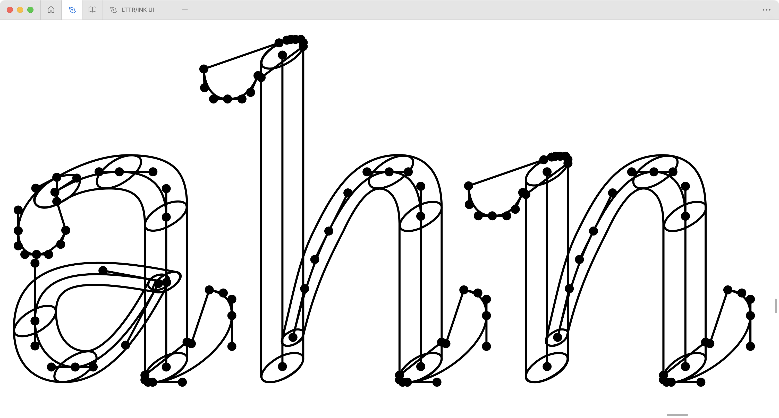
Figure is complete design scheme of
skeleton type design presented in this thesis. The following images
explain its methods
From the stroke-based approaches emerged the Skeleton type design
(Paldia 2016,
2018), which is defined as an approach
that combines booth 1.) the stroke approach and 2.) the outline or
contour approach. The so-called stroke heartline is used as
a construction – a skeleton – that mounts stroke shapes and non-stroke
shapes – outliners – into a final letter form.
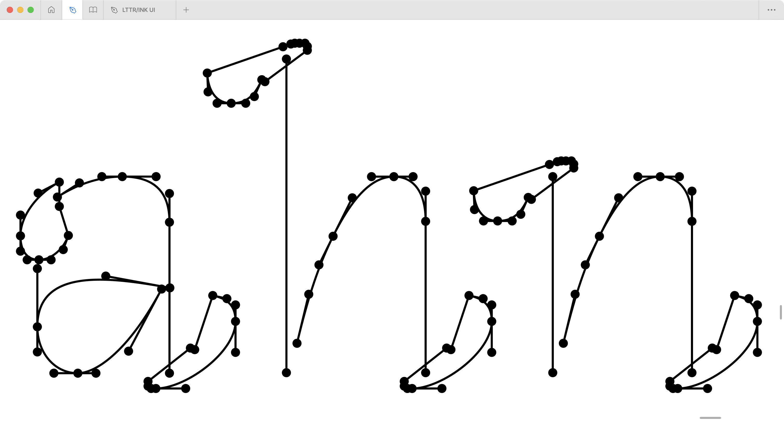
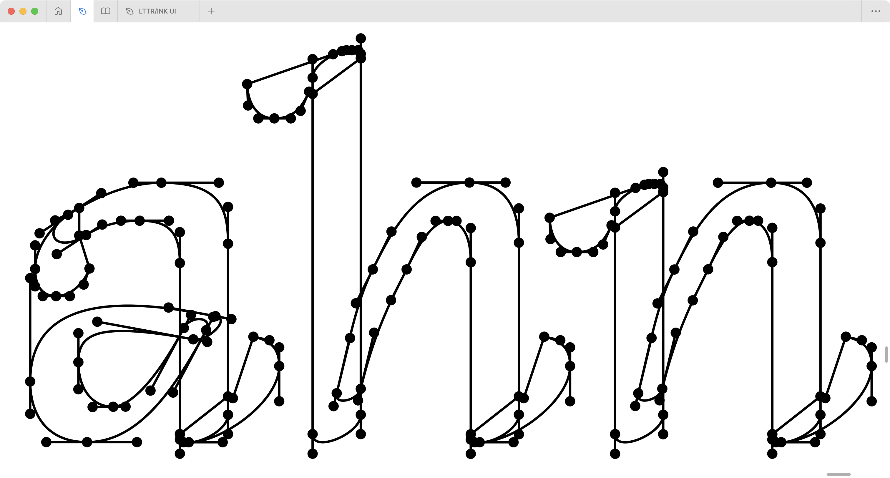
Skeleton is an element of the graphical
user interface that defines a path of the tool imprint and position of
anchored outliners.Imprint is the shape of a digital tool
tip that draws a stroke shape by rendering along a
skeleton.Stroke is a letter shape created by
writing or drawing with a physical or digital stroke tool
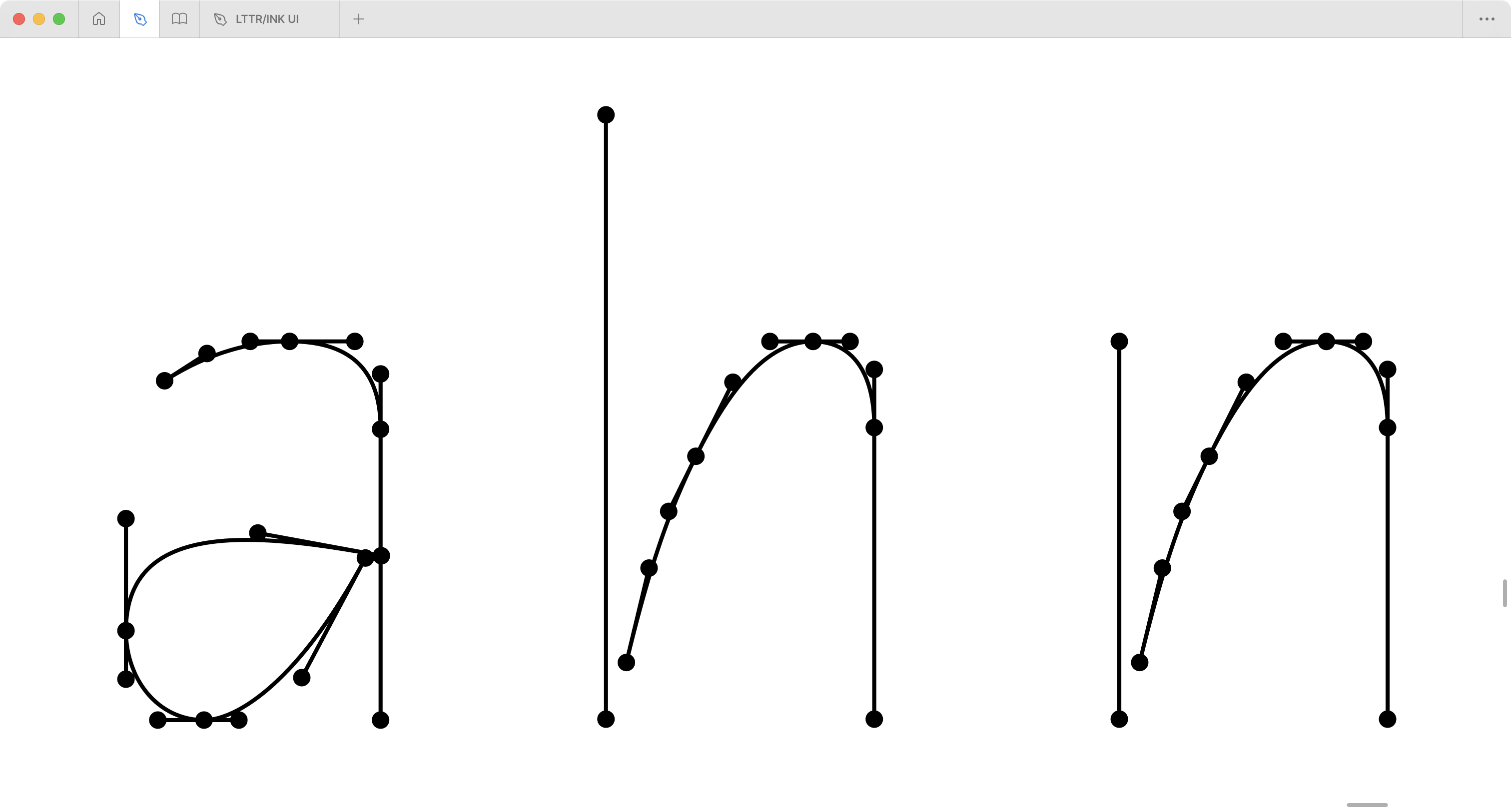
Stroke in typography almost never keeps the same width along the
skeleton. It is important to stress that the stroke is modulated.
Noodrzj (Noordzij
2006) coined the stroke concept with modularity as stroke
contrast.
The stroke contrast is created by:
imprinting the shape of the writing tool, changing the shape
pressing the tool to the expand imprint
rotating the tool to rotate the imprint.
A designer can use all the perks at the same time.
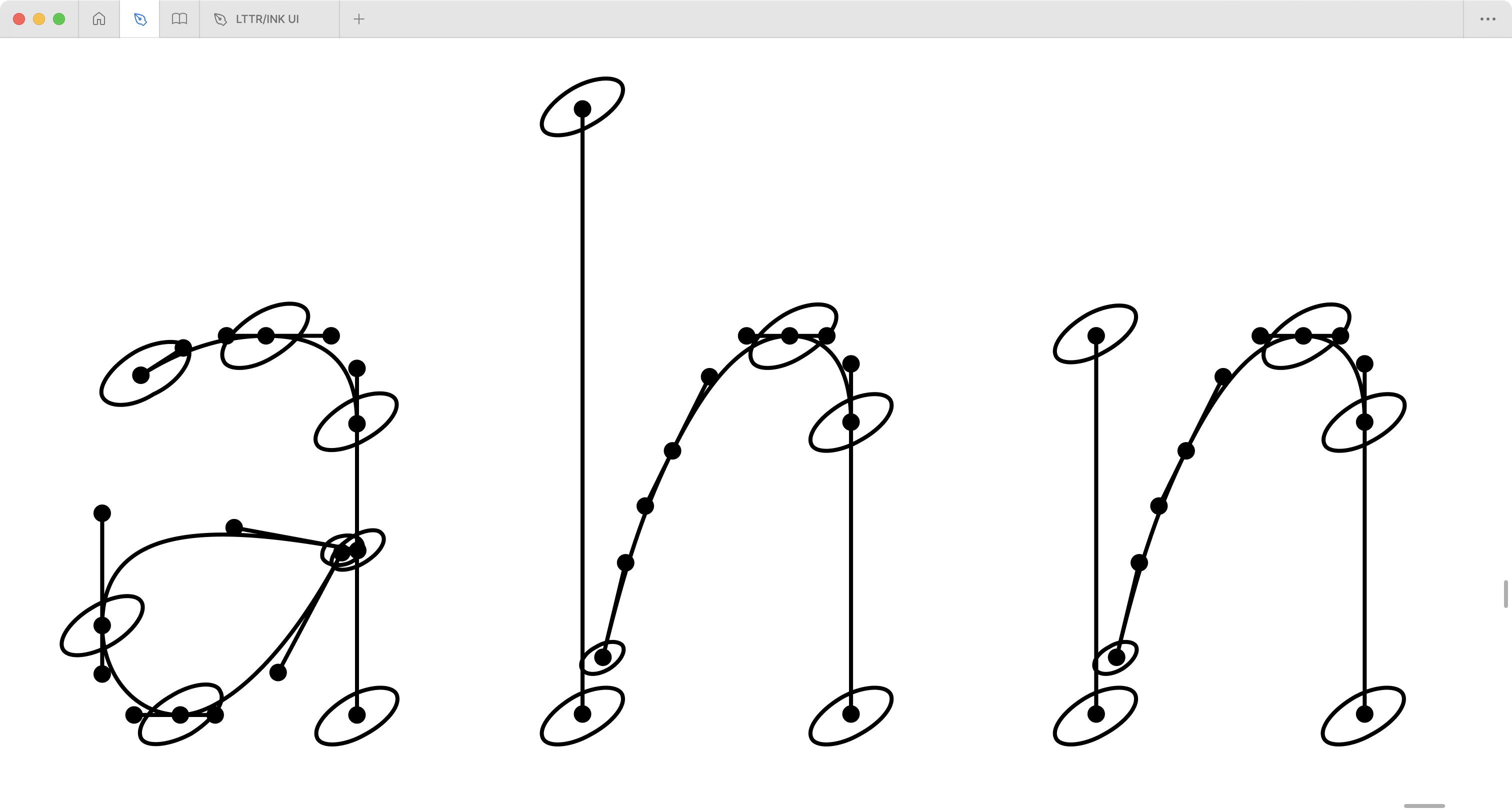
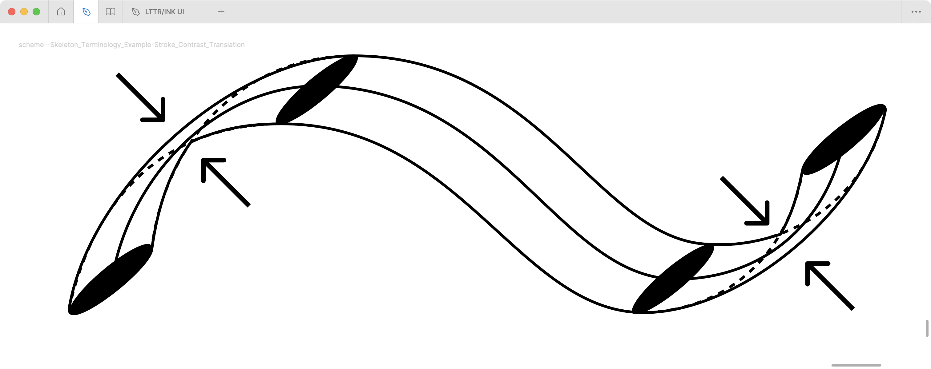
The translation is the contrast produced by the broad-nibbed pen. In
skeleton-type design, the translation effect is achieved by any imprint
shape that differs from the circle. The circle imprint renders
a so-called monolinear stroke with literary nil translation
contrast.
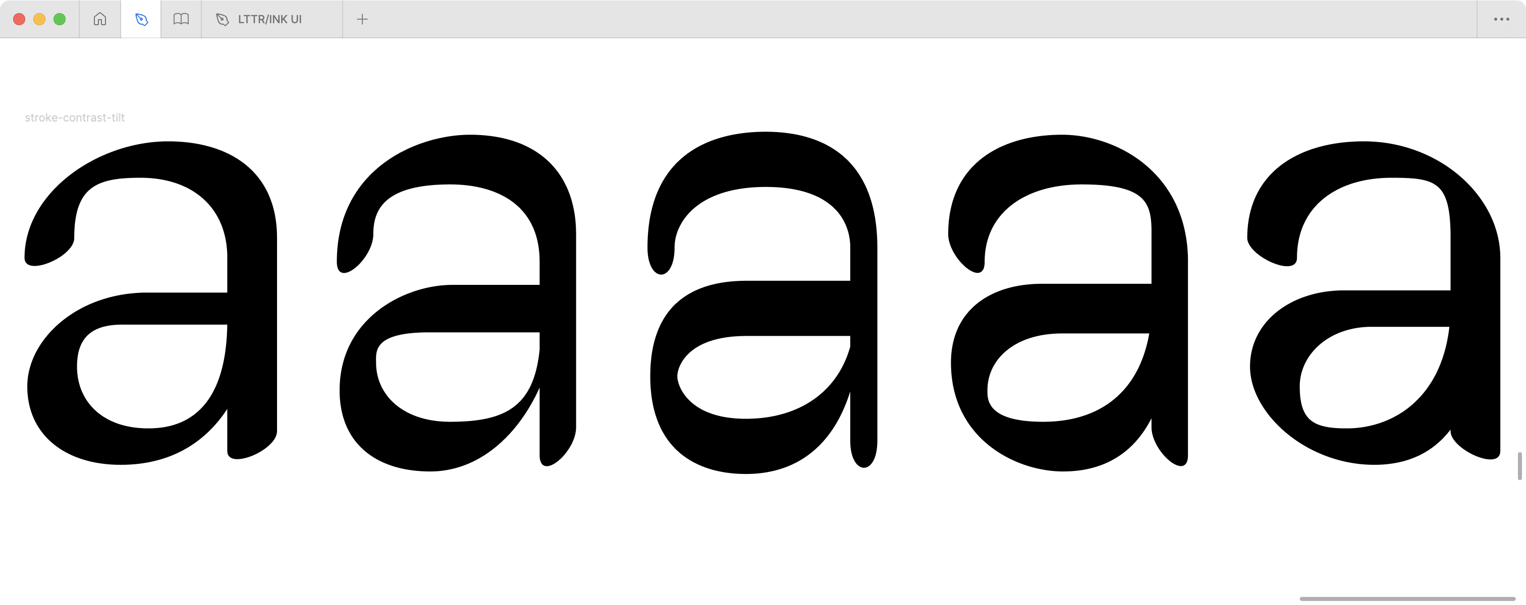
Contrast tilt is a default contrast angle
related to the writing medium or related to a skeleton. By tilting the
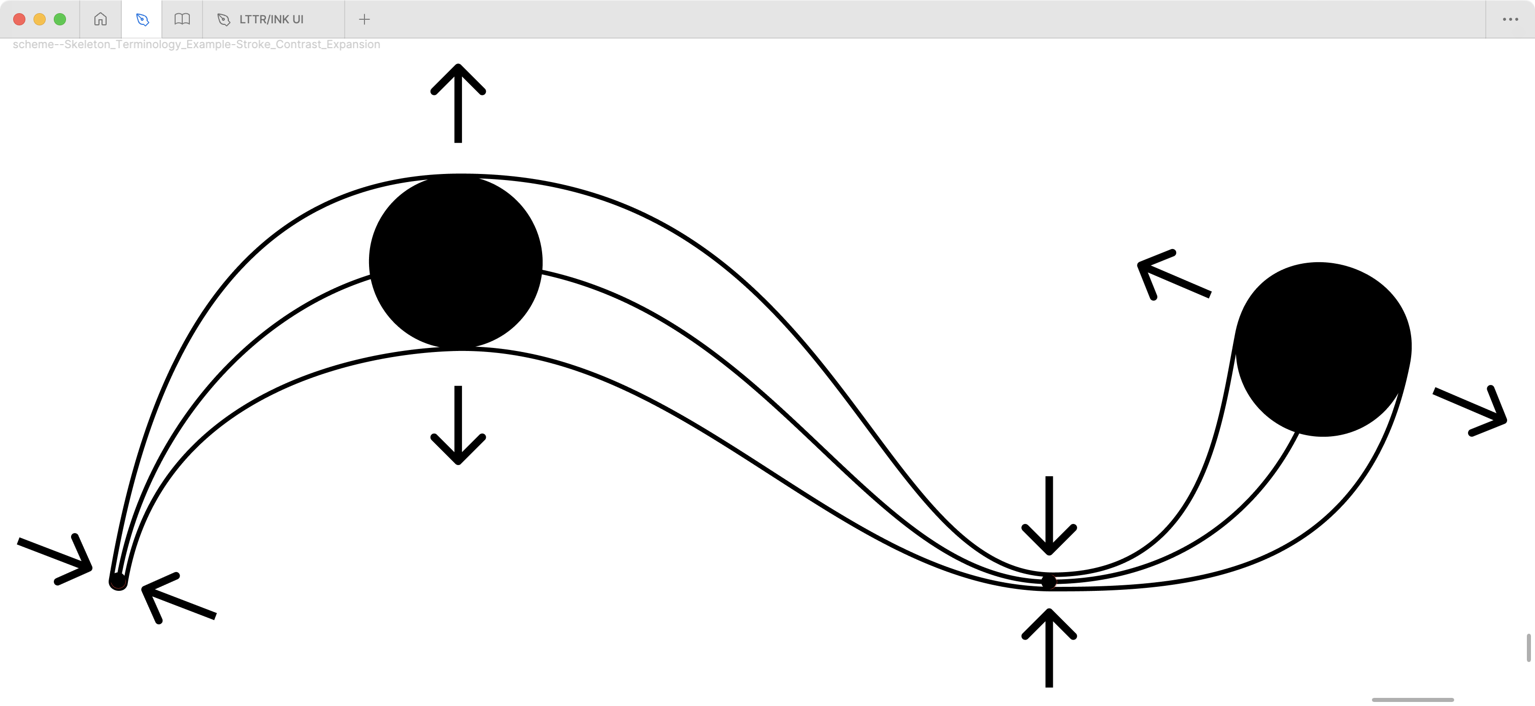
contrast, we can achieve the so-called reversed contrast.Expansion is the contrast usually
produced with a pointed pen or brush, whereby increasing the pressure
makes the two halves of the pen part, thus causing a gradual thickening
of the stroke. In Skeleton type design, the expansion effect is achieved
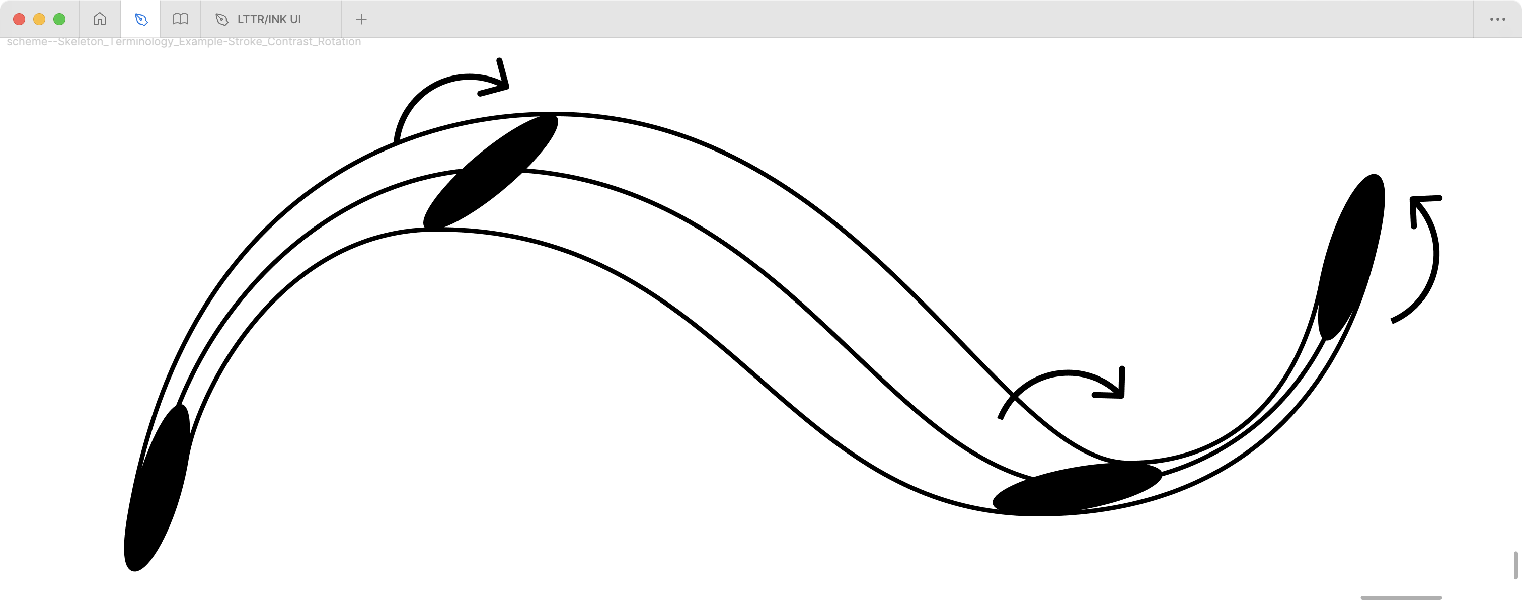
by various scales of the Imprint.Rotation is the contrast produced by the
rotation of a pen. In skeleton type design, the rotation effect is
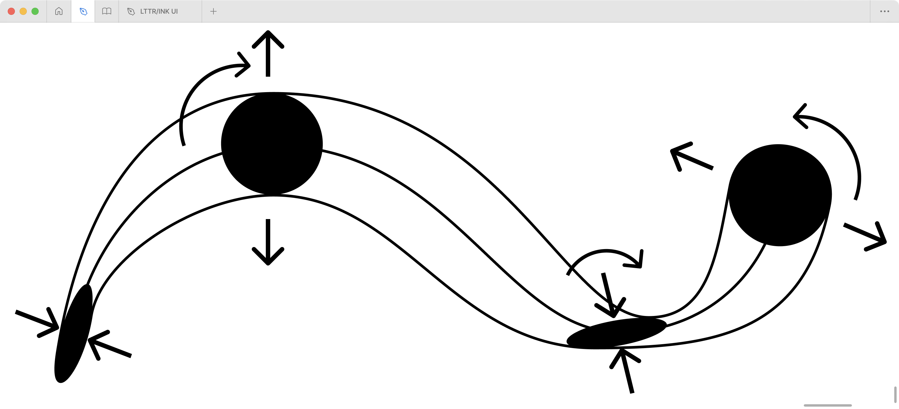
achieved by various angles of imprint.Figure presents when designer uses all
the stroke contrast perks together on single skeleton.Contrast tilt is a default contrast angle
related to the writing medium or related to a skeleton. By tilting the
contrast, we can achieve the so-called reversed contrast.The outliner is a letter shape created by
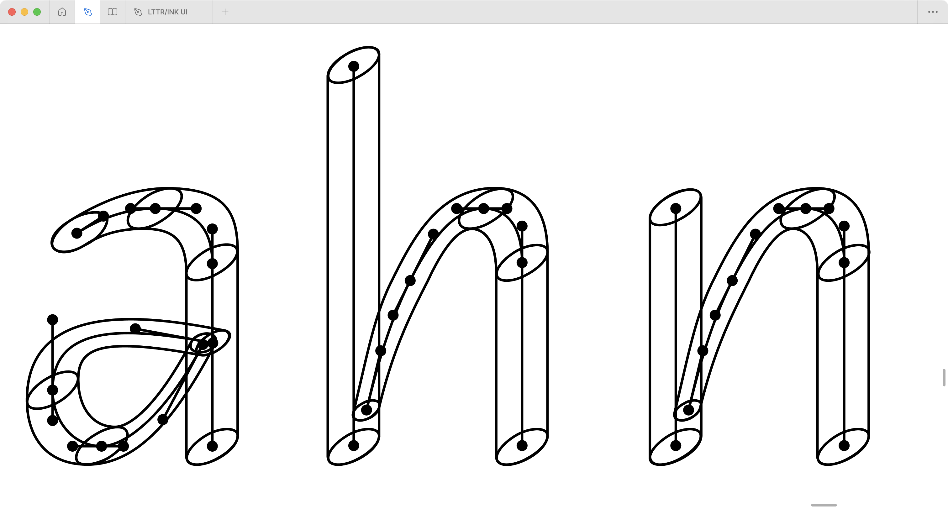
drawing with a digital stroke tool, typically Bézier
curves.The final result after converting strokes
to outlines for font production. Individual components can be merged
into single outline shapes.
The power of skeleton type design manifests in its systematic
approach to setting parameters for repetitive shapes – particularly
strokes. This systematic nature aligns with parametric type design, a
concept thoroughly investigated by Hersch and colleagues (Hu
and Hersch 2001; Hassan, Hu, and Hersch 2010). Their
research demonstrates how parameters serve as precise controls for
typographic attributes, enabling systematic manipulation of letterforms.
While the notion of parameters in type design might initially suggest
creative constraints, it paradoxically offers expanded possibilities for
controlled variation. This systematic approach proves particularly
valuable when constructing a regularised dataset, where the parametrised
skeleton type design method facilitates the generation of extensive
style variations.
Hassan, Tamir, Changyuan Hu, and Roger D. Hersch. 2010. “Next
Generation Typeface Representations: Revisiting Parametric
Fonts.” In Proceedings of the 10th ACM Symposium
on Document Engineering, 181–84. Manchester United
Kingdom: ACM. https://doi.org/10.1145/1860559.1860596.
Hu, Changyuan, and R. D. Hersch. 2001. “ParamFont:
Parameterizable Fonts Based on Shape Components.”IEEE Computer Graphics and Applications 21 (3): 70–85. https://doi.org/10.1109/38.920629.
If this work is useful for your research, please cite it as:
@phdthesis{paldia2025generative,
  title={Research and development of generative neural networks for type design},
  author={Paldia, Filip},
  year={2025},
  school={Academy of Fine Arts and Design in Bratislava},
  address={Bratislava, Slovakia},
  type={Doctoral thesis},
  url={https://lttrface.com/doctoral-thesis/},
  note={Department of Visual Communication, Studio Typo}
}